
What to Show on Your Photography Website (And What to Leave Out)
What to Show on Your Photography Website (And What to Leave Out)
One of the most common things I notice when I review photography websites has very little to do with the quality of the work.
It’s usually the editing.
Not photo editing—the decisions about what makes it onto the website in the first place.
Most photographers don’t struggle because they have too little to show. They struggle because they have too much.
After years of shooting, it’s natural to become attached to different projects. Each one represents a client, a location, a favorite image, or a memory of the day. When it’s your own work, it’s hard to look at it objectively.
The problem is that visitors don’t experience your portfolio that way.
They’re not thinking about the effort behind each image or remembering the story of the shoot. They’re simply taking in the collection as a whole and asking themselves one question:
“Is this the kind of work I’m looking for?”
That’s why curation matters so much.
A portfolio isn’t meant to document everything you’ve created. It’s meant to communicate the kind of work you want to create more of.
Sometimes that means leaving out photographs you genuinely like because they don’t strengthen the overall story you’re trying to tell. An image doesn’t have to be bad to be the wrong fit. It simply has to make the collection feel less focused than it could be.
The same idea applies to projects.
When every session you’ve ever photographed lives on your website, visitors are left to sort through it all on their own. Most won’t. They’ll look at a handful of galleries, form an impression, and move on.
That’s why I usually encourage photographers to think less about adding and more about replacing.
As your work evolves, let your portfolio evolve with it.
When a new project better represents where you’re headed, it may be time for an older one to step aside. That doesn’t erase the work you’ve done. It simply keeps your website aligned with the business you’re building today, not the one you were building three years ago.
I also think it’s helpful to remember that your website isn’t an archive.
It’s a guided experience.
Every decision—from the order of your galleries to the first image someone sees—is quietly shaping how your work is perceived. You’re helping visitors understand what you value, what you’re known for, and what they can expect if they hire you.
That’s a very different goal than simply displaying everything you’ve created.
Whenever I’m designing a photography website, I’m thinking about that experience just as much as the photographs themselves. How does someone move through the work? Where do they pause? What do they remember when they leave?
Those questions are often more important than whether the portfolio contains twenty projects or forty.
If your website has started to feel scattered, the answer usually isn’t creating more content.
It’s taking another look at what’s already there and asking whether every image, every gallery, and every project is still earning its place.
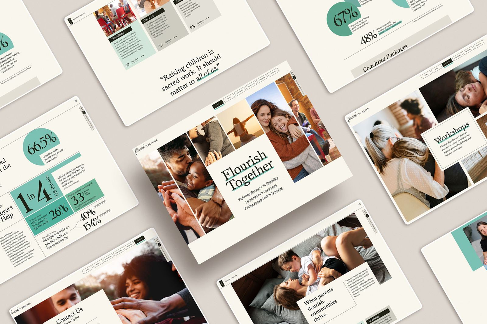
That belief shaped the way I designed Reverie. The template is intentionally structured to help photographers present their work with clarity, giving each project room to breathe while guiding visitors through the portfolio instead of asking them to make sense of it on their own.
Because a strong portfolio isn’t measured by how much it contains.
It’s remembered for how clearly it communicates who you are.
Check it out here: https://madmagentacreative.com/product/test_reverie-website-template/
And let me know if you have any questions or want some help digging into your site!
be the first to leave a comment