
What Does Bold Branding Really Mean?
We live in a world where you’re hit with design every second of the day—scrolling through your feed, walking down a street in LA, grabbing something off a shelf at the grocery store. Branding is everywhere. Constant. Relentless.
Most of it is forgettable.
It blends together into one big visual blur. Same color palettes. Same typefaces. Same safe, polite, vaguely-pleasant, meh energy.
That’s why bold branding matters.
Not “loud” branding.
Not trendy or trying-too-hard branding.
Not obnoxiously fluorescent and screaming in your face.
Bold branding is the kind that knows who it is—and isn’t afraid to say it clearly.
It doesn’t whisper.
It doesn’t blend.
It doesn’t apologize.


Let’s rewind for a second.
Not that long ago, branding was something you only thought about if you were one of the big guys… the Coca-Cola or Apple. Something with a big agency budget, big media buys, big billboards.
But now?
Now anyone with an iPhone and an idea can start a business.
That’s the beauty of it.
That’s the wild frontier.
You can build something from your kitchen, your garage, your brain at 2 a.m.—and if you do it right, it can go viral, get shelf space, change lives.
But … the catch is:
Now, everyone’s trying.
Everyone’s launching.
Everyone’s designing.
Everyone’s out there.
And in a sea of noise, “looking good” just isn’t enough anymore.
So what is bold?
Bold is clear.
Bold is real.
Bold is unmistakable.
Bold is… relative too.
Let’s talk visuals for a sec:
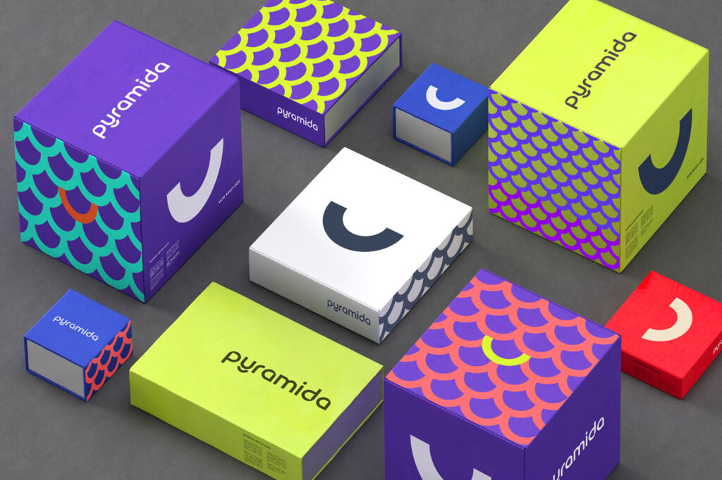
- Imagine walking down a grocery aisle crammed with sauces and jars and trendy fonts. But your eyes land on one: a truffle sauce with a label so confident it feels like it’s staring back at you. That’s bold.
- Scroll past 12 fashion ads that all look like they were made with the same Canva template… then BAM—one that’s minimalist, but with a vibe that says “we know exactly who this is for.” That’s bold.
- A wall of skincare brands with pastel labels, plant doodles, and soft words like “gentle” and “pure.” Then—BAM. One sleek bottle. Black and white. Clean. Elevated. Intentional. That’s bold.
Bold doesn’t have to be loud.
In fact, sometimes the boldest brands are the simplest ones in the room—they just speak with complete clarity.
And in branding, clarity is power.


Bold doesn’t yell.
It doesn’t chase.
It doesn’t mimic.
Bold branding cuts through.
It holds eye contact.
It says, “this is who I am.”
It’s not about being the biggest.
It’s about being unmistakable.
In a world this noisy?
That kind of clarity isn’t just beautiful.
It’s necessary.
—
Want more truth bombs like this?
Follow along. I’ve got more coming.
Because your brand doesn’t deserve to blend in.
It deserves to be bold.

be the first to leave a comment