
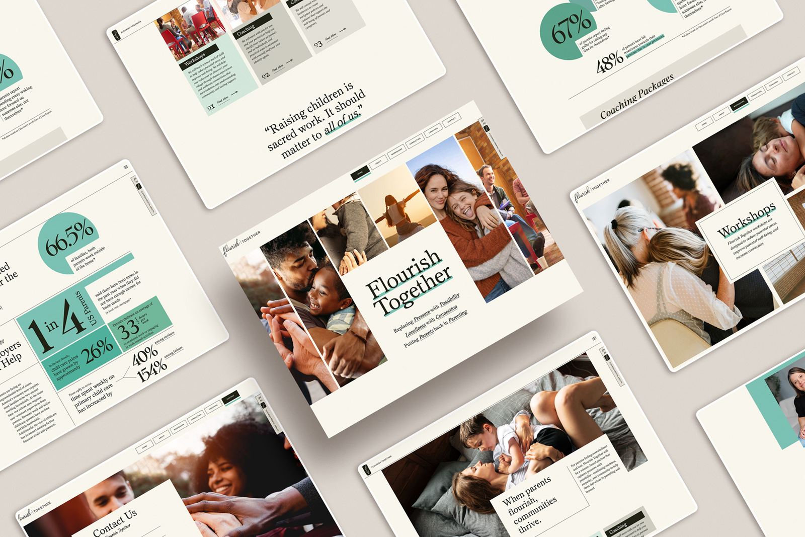
What a Strong Photography Homepage Actually Does
Most photography websites drop you into a mix of work or a long scroll of images and leave you to figure it out.
On the surface, it looks fine. The work is strong. The images are beautiful.
But when someone lands there, something important is missing.
Not talent. Not quality.
Direction.
Your homepage isn’t just where people see your work. It’s where they decide if they understand what you do, trust you to do it, and want to keep going.
And that decision happens quickly.
If your site doesn’t guide them, they’re left to do that work on their own.
Most people won’t.
It’s like being a new student dropped into a school mid-year, in the middle of lunch, with no introduction and no sense of where to go. Everything is happening around you, but none of it makes sense yet. You don’t settle in. You just want to leave.
That’s what most websites feel like.
A strong homepage does something different. It doesn’t try to show everything. It shows the right things, in the right order, and gives someone a clear way to move through it.
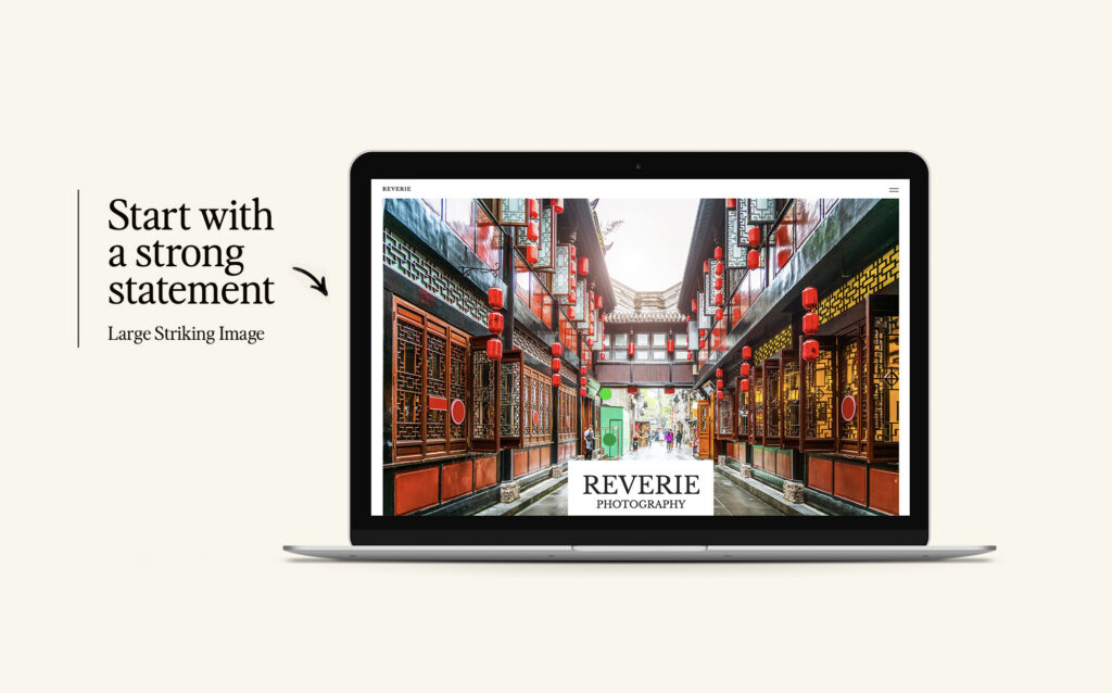
It starts with hierarchy. When someone lands on your homepage, they should immediately know what kind of work you do, what stands out about it, and where to look first. This doesn’t come from adding more content. It comes from choosing what matters and putting it forward. Your best, most representative work shouldn’t be buried in a gallery. It should lead.
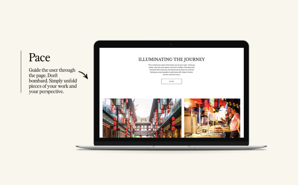
From there, there needs to be a clear sense of what you’re known for. This is where most sites stay too vague. If someone has to scroll through dozens of images to understand your style or your specialty, you’ve already made it harder than it needs to be. Your homepage should quietly answer what kind of work you want more of and what you do especially well. Sometimes that comes through words, but often it’s clearer when it’s shown through the work you choose to feature and how you structure it.
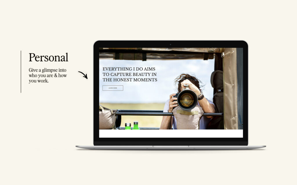
There also needs to be a glimpse of you, but not in a way that makes the experience about you. This is where people often go to extremes. They either say nothing or they say too much too soon. What actually works is something in between. A short moment that gives someone a sense of how you think, how you approach your work, and what it might feel like to work with you. Not a full story. Just enough to build trust. And importantly, it should still feel helpful to them, not just descriptive of you.
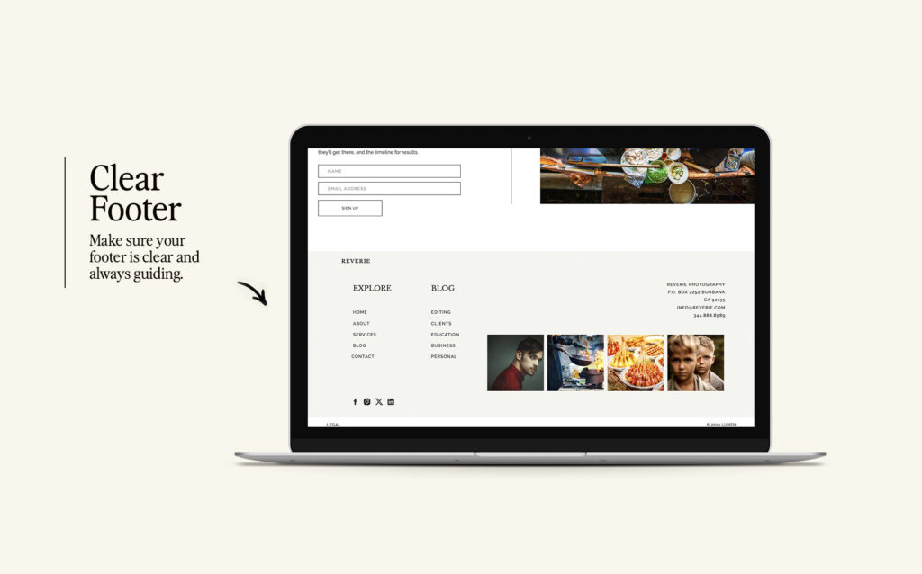
Finally, your homepage should guide someone to what comes next. After they’ve seen your work and started to understand you, they shouldn’t be left wondering where to go. A strong homepage points them forward. It leads them into a specific body of work, a deeper look into your process, or a clearer understanding of what working with you looks like. It removes the need to guess.
When these pieces are in place, your site starts to feel different. It no longer feels like something someone has to sort through. It feels like something that’s leading them somewhere. There’s clarity, there’s momentum, and there’s a growing sense of confidence.
And that’s what actually makes someone choose you.
Not just beautiful images. Not just a large body of work.
But the feeling that they understand what you do, they trust how you do it, and it all feels aligned with what they’re looking for.
Your homepage isn’t just there to show your work. It’s there to help someone move from interest to decision.
If your site isn’t doing that yet, it’s usually not a design problem. It’s a clarity and structure problem. And once that’s fixed, everything else gets easier.
If you want to see what this looks like in practice, I’ve built Showit templates designed around this exact structure. You can explore them here:
https://madmagentacreative.com/new-listing-shop-page/

be the first to leave a comment