
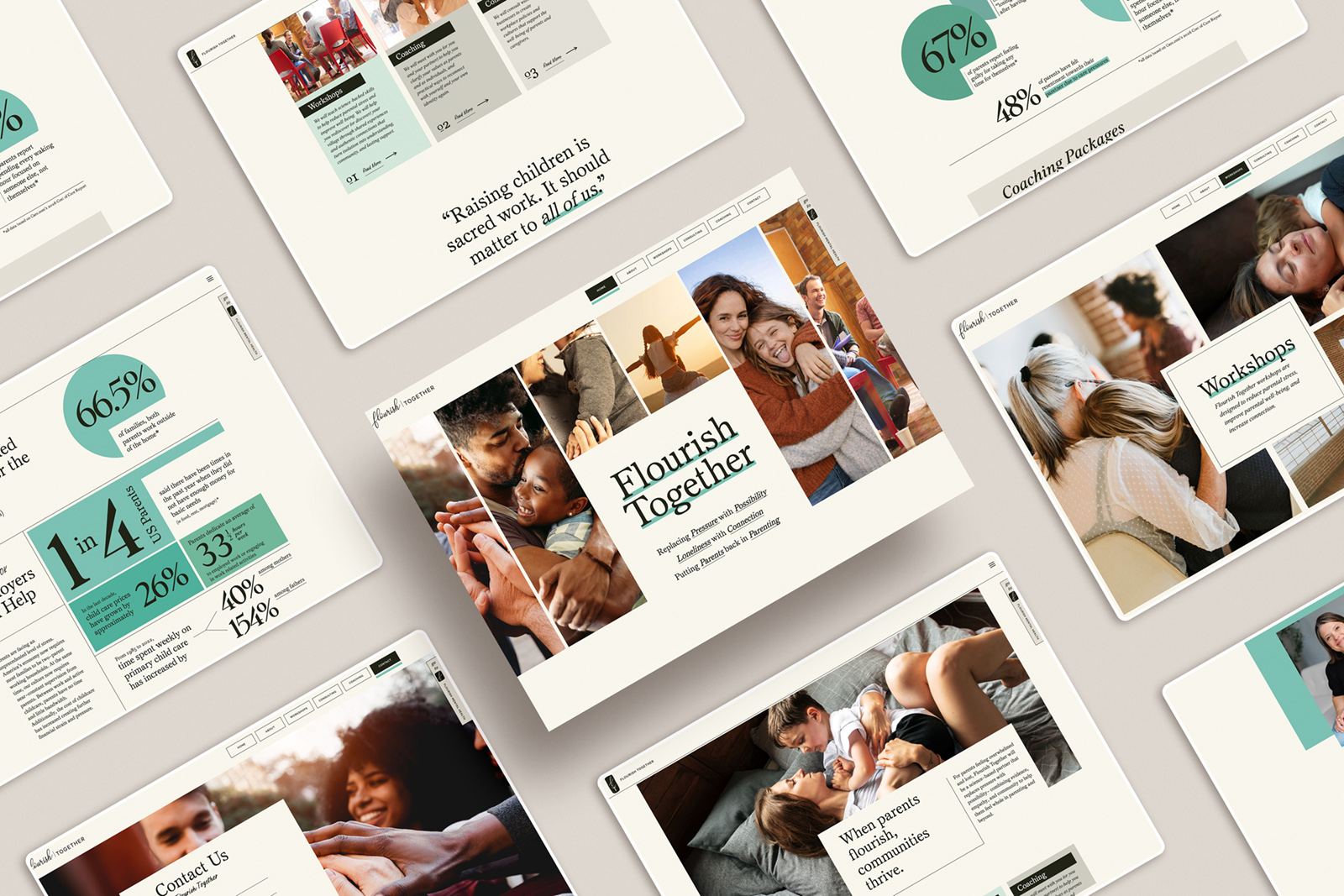
What to Show on Your Photography Website (And What to Leave Out)
One of the biggest mistakes I see on photography websites is actually really simple.
There’s just too much.
Too many images, too many projects, too many directions. And it usually comes from a good place… you’ve done a lot of work, you’re proud of it, and you want to show the full range of what you can do.
But when everything is included, nothing really stands out.
A stronger website isn’t about showing more. It’s about being more intentional with what you show.
If an image isn’t strong enough to stand on its own, it’s out.
Not “maybe it still works.” Not “I kind of like this one.” Out.
Because the moment something feels even slightly weaker, it doesn’t just sit quietly on the page. It lowers the perception of everything around it.
The same goes for your projects.
You don’t need thirty. Most clients aren’t going to go through that many anyway. They’ll look at a handful, get a sense of your work, and make a decision quickly.
So it’s better if you control which ones they see.
Instead of constantly adding more, start thinking in terms of replacement. When something stronger comes in, it takes the place of something older. Your site stays tight, focused, and current.
There are always exceptions to the numbers, but in general, clarity beats volume.
And this is where things really start to shift.
When you’re this selective, you become the guide.
You’re not just putting work on a page and hoping it lands. You’re shaping the experience. You’re deciding what someone sees first, what they understand about your work, and what they walk away remembering.
You’re not just showing your work, you’re directing how it’s seen.
That’s better for your client because they get a clear, streamlined view without having to sort through everything themselves.
And it’s better for you because you’re no longer leaving that interpretation up to chance.
If your site feels a little scattered or harder to navigate than it should be, this is usually where to start. Not by adding more, but by refining what’s already there.
If you want a structure that supports this kind of clarity, I’ve created Showit website templates designed to help you present your work in a more focused, intentional way.
Check it out here: https://madmagentacreative.com/product/test_reverie-website-template/
And let me know if you have any questions or want some help digging into your site!

be the first to leave a comment