
Mood Boards Are Where Strategy Becomes Visual
Mood boards are often treated as a collection of things that look good.
Personal taste. Aesthetic preferences. Visual inspiration gathered early on to set a mood.
That approach misses what makes them useful.
In my work, mood boards are not about taste. They are about direction.
By the time we reach this stage, the work underneath has already been done. We have talked deeply. We have dug into the business, the values, the tensions, the goals. We understand what sits at the core of the brand and where it needs to go.
Mood boards are how that understanding becomes visible.
They are not vague. They are not exploratory for the sake of exploration. They exist to narrow the field and bring focus.
This is the point where possibility starts to give way to intention.

Why This Moment Matters
A brand can go in countless directions. Many of them beautiful.
Without a strong visual filter early on, the process can drift. Decisions start to feel subjective. Feedback becomes emotional. Everyone senses when something is off, but it is hard to articulate why.
Mood boards create a reference point before design begins.
They give us something steady to return to as the work unfolds. When questions come up later, and they always do, we are not guessing. We are checking decisions against a direction we already agreed on.
Does this feel aligned with the brand we defined?
Does this move the work forward, or sideways?
Does this support the long-term vision, or distract from it?
Just as importantly, mood boards create shared language.
When I talk about refinement, warmth, restraint, or expressiveness, we are not interpreting those words differently. We are seeing the same thing. That early alignment is what allows the work to stay cohesive from start to finish.
What I Pay Attention To
My mood boards are intentionally specific. Their purpose is not to explore every option. It is to guide us toward better ones.
They usually include a few key elements.
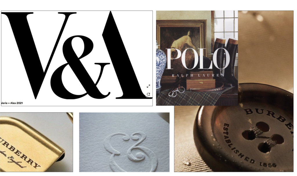
Typography direction
Not final fonts, but a clear sense of tone. Editorial or modern. High contrast or softer. Structured or expressive. This defines the lane so typography later supports the brand rather than fighting it.
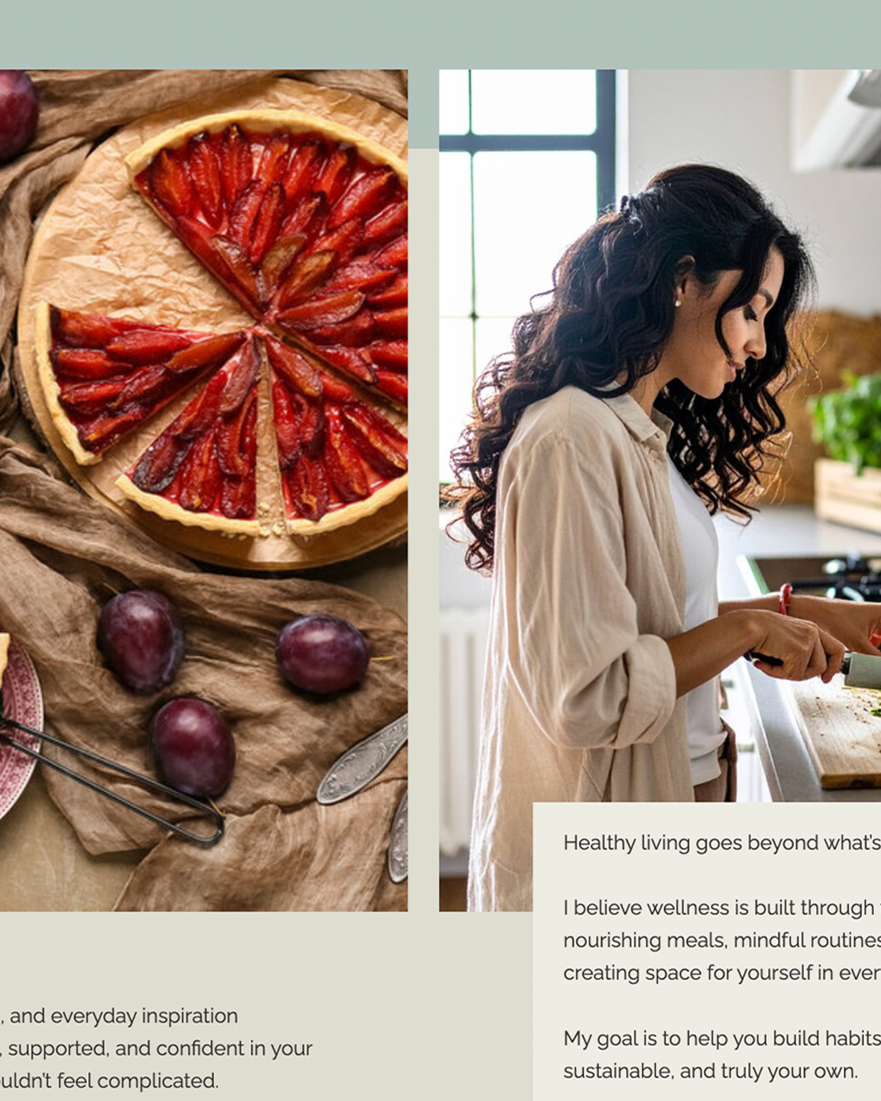
Photography direction
Light, composition, subject matter, and mood. Imagery carries enormous emotional weight. Setting this early keeps the brand from feeling inconsistent or scattered.
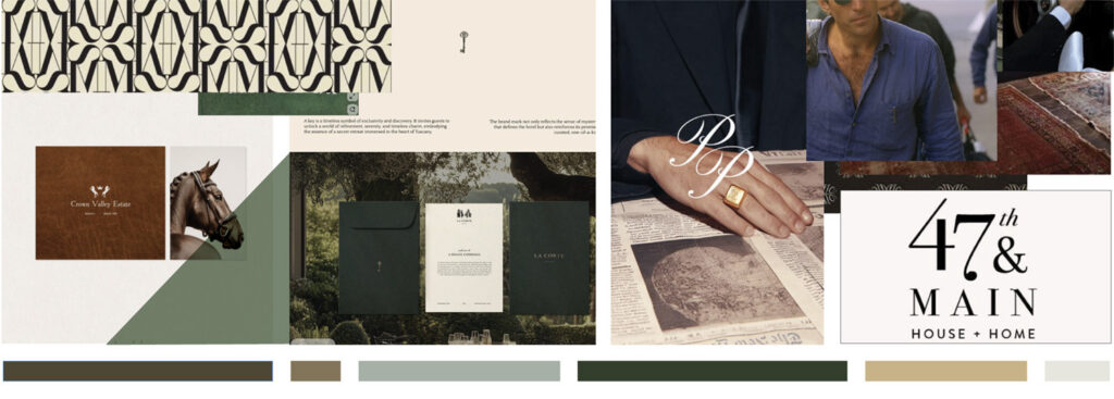
Color relationships
Rather than listing every possible color, I focus on how colors interact. Core tones, supporting hues, contrast, and value. This creates clarity without locking anything down too soon.
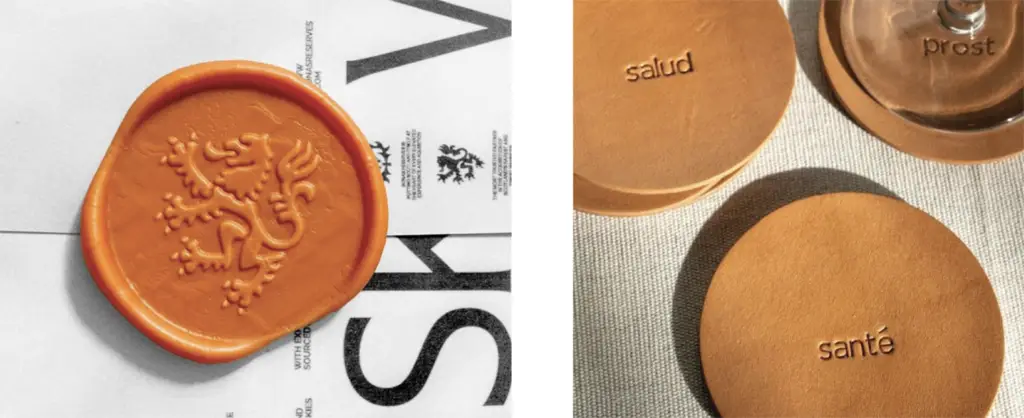
Texture and material
Texture brings depth. Paper, fabric, subtle grain, or material references help inform not just visual design, but how the brand might live in print, packaging, or physical spaces later on.
Each element is there for a reason. Nothing contradicts the direction we are setting.
A Tool That Quietly Guides the Work
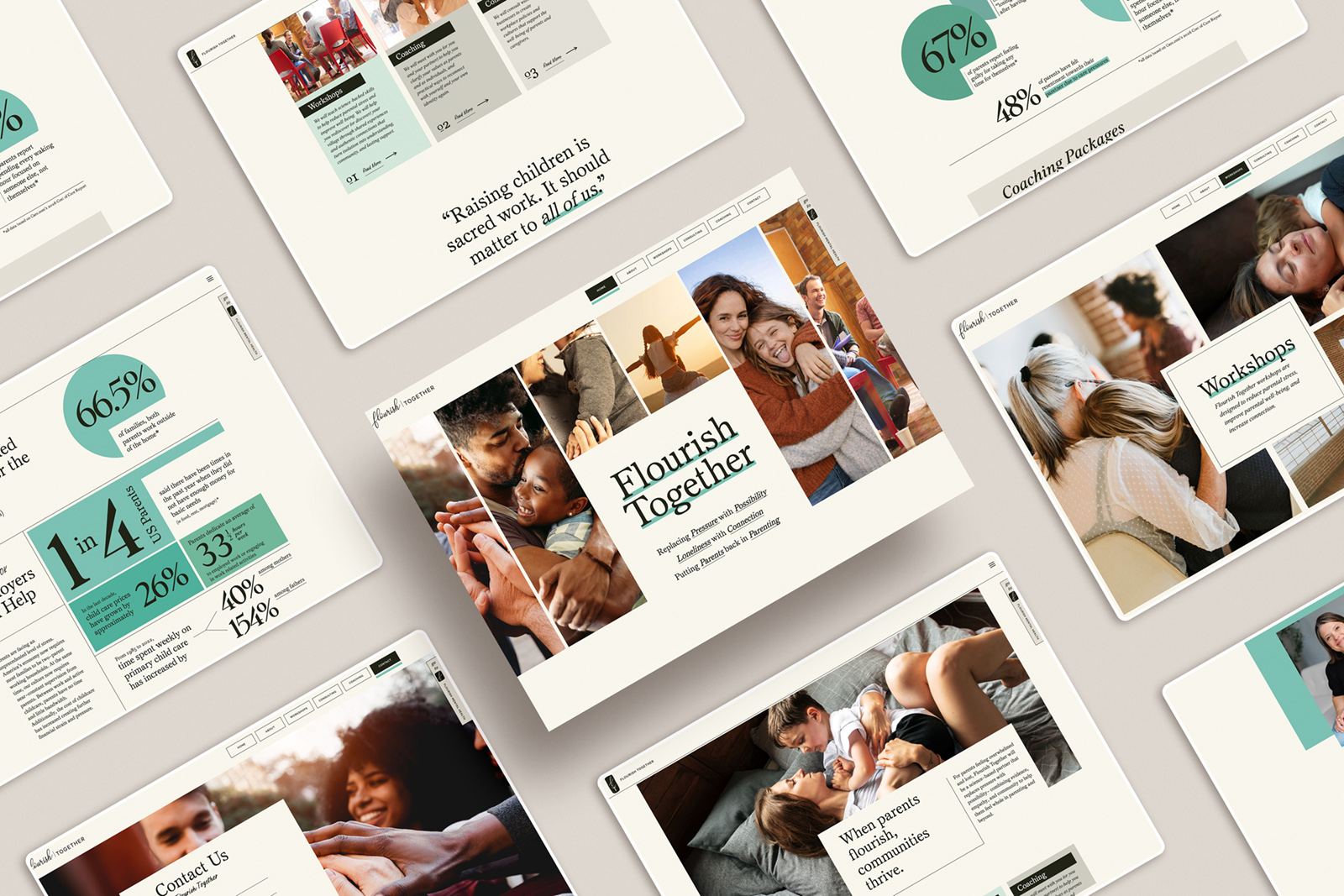
A strong mood board makes the next step easier.
It does not overwhelm. It does not compete with itself. It gently pushes the work toward specificity.
Typography choices feel grounded. Color decisions feel intentional. Layout and imagery have a framework to live inside. The design phase becomes refinement rather than guesswork.
The mood board does quiet work in the background the entire time.
Alignment Changes Everything
Mood boards are a shared point of reference.
They guide my decisions as a designer, and they give clients confidence as the work evolves. We are not reacting to individual pieces. We are building toward something we already understand together.
When branding looks good but does not quite feel right, this step is often what is missing.
Mood boards are not about what I like.
They are about creating a brand that knows who it is and has a clear direction forward.
be the first to leave a comment