

Color Matters.
Choose Carefully!
Before someone reads a single word on your website…
Before they know what you do…
Before they understand your mission, your offer, or your strategy…
They feel something.
That feeling?
It often starts with color.
We don’t always realize it — but color does a lot of heavy lifting. It sets the tone. It establishes mood. It shapes perception faster than copy or photography ever could.
Color is primal.
Emotional.
Immediate.
And in branding, that makes it one of your most powerful tools.
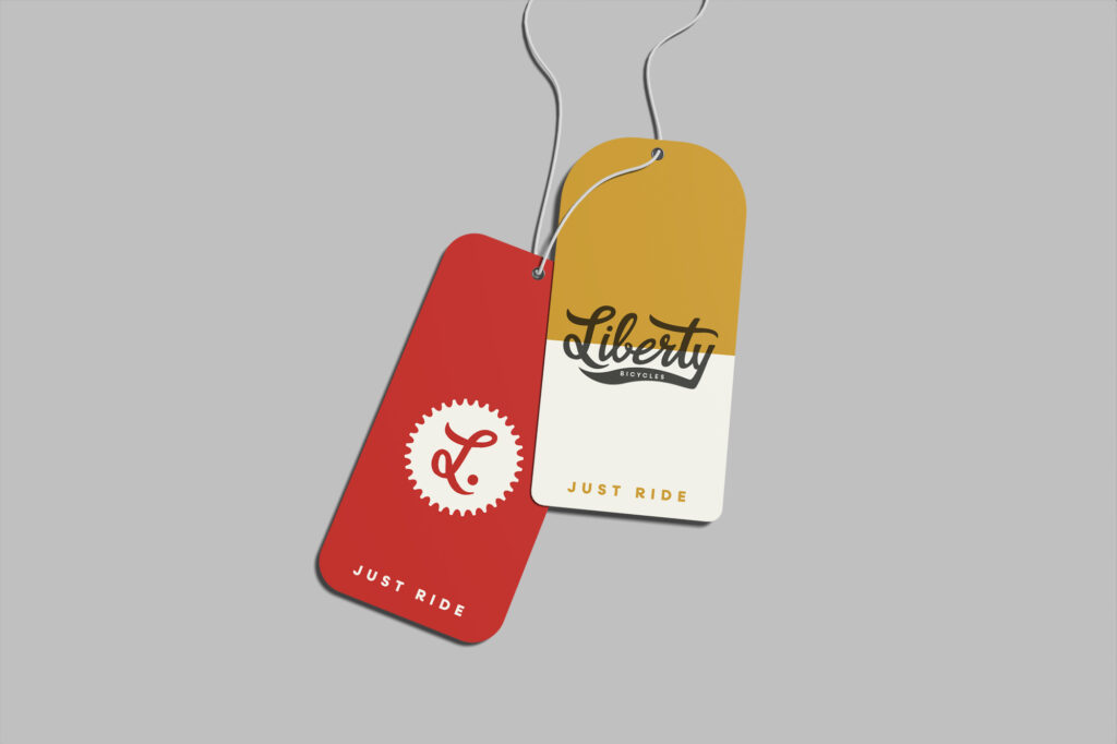
Let’s say you’ve built a clean, tech-forward brand.
The palette is bold: black and deep green.
Your typography is modern. The spacing is sharp. Everything feels clear, intentional, minimal. Like the future.
You apply this across your site. Your packaging. Maybe it shows up on a matte black water bottle or a sleek storefront.
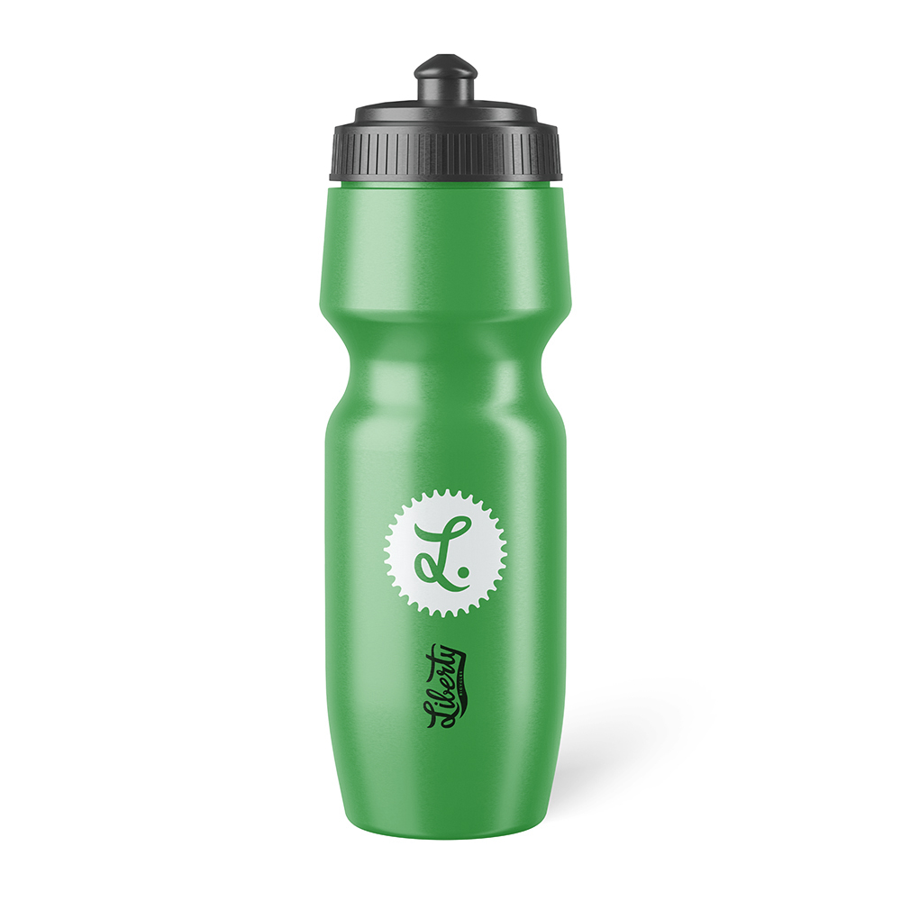
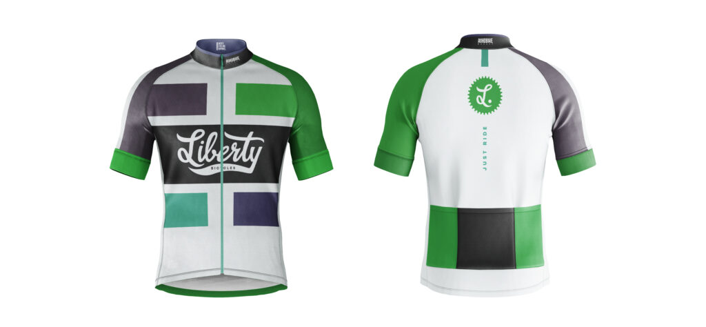
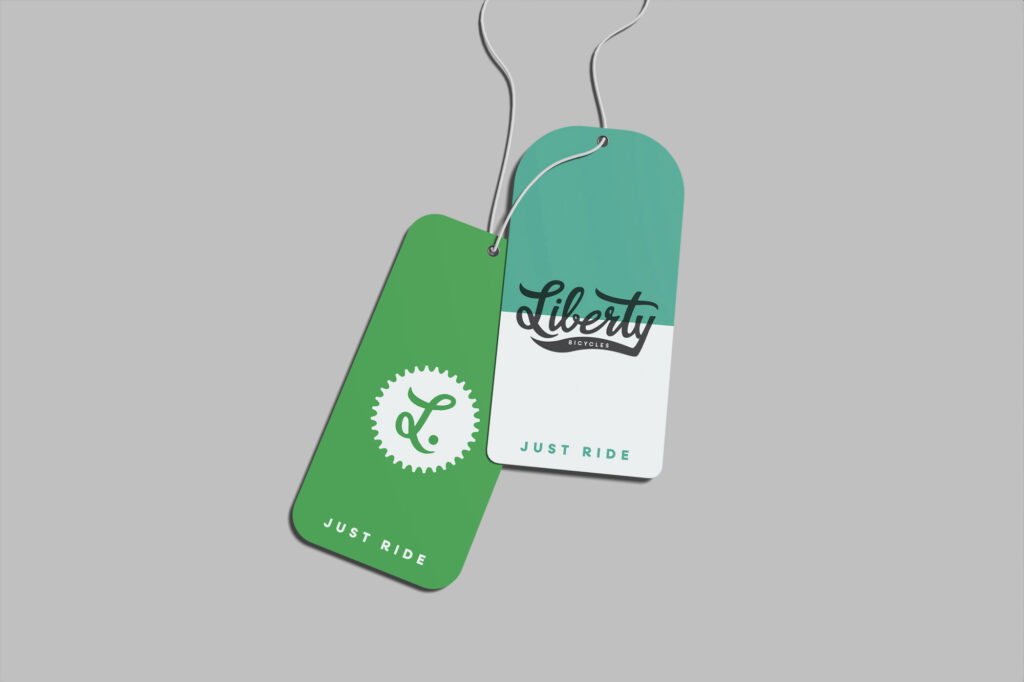
Instantly, your audience starts picking up the cues:
Innovative. High-end. No fluff.
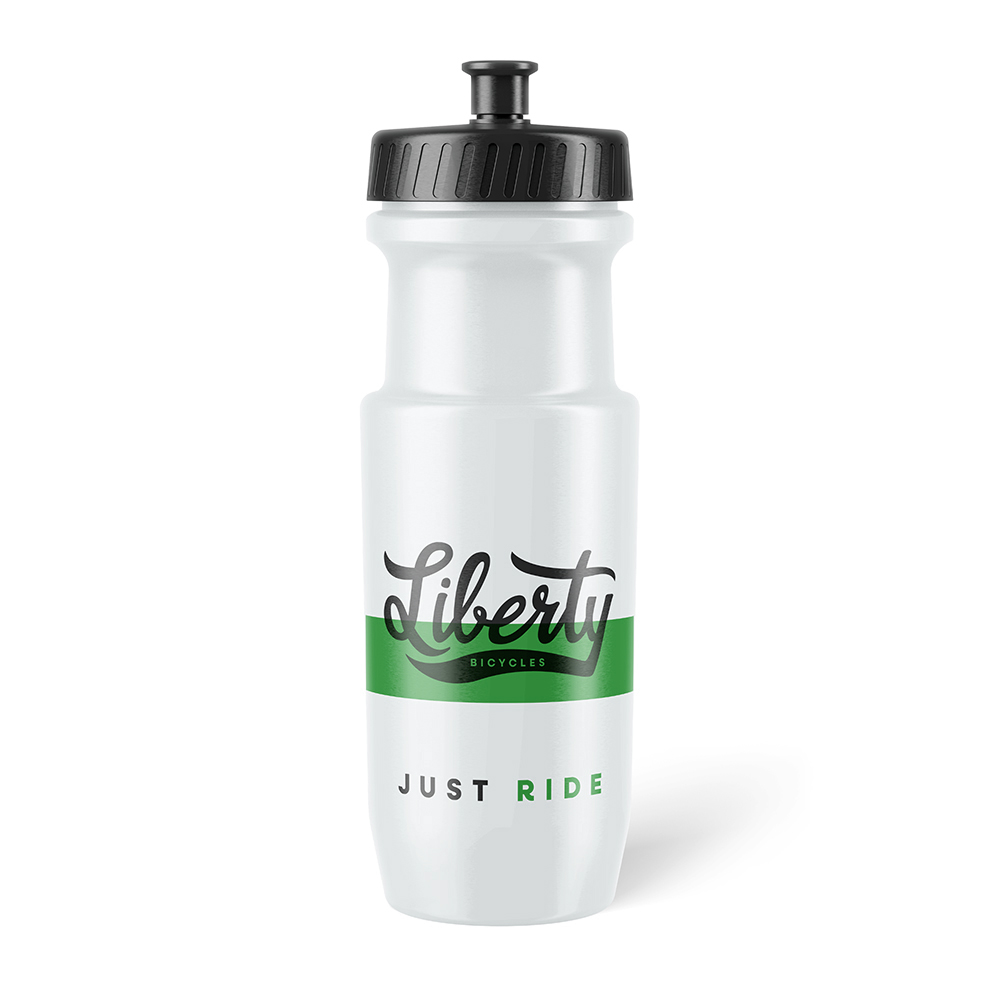
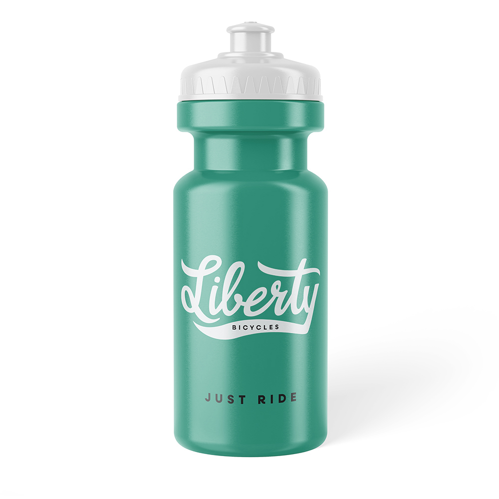
But what happens when you change the color?
Imagine swapping in a soft yellow. A dusty pink. Cream, teal, a pop of coral.
Suddenly, your same product — same logo, same structure — feels totally different.
Lighter.
Nostalgic.
Retro.
Emotional.
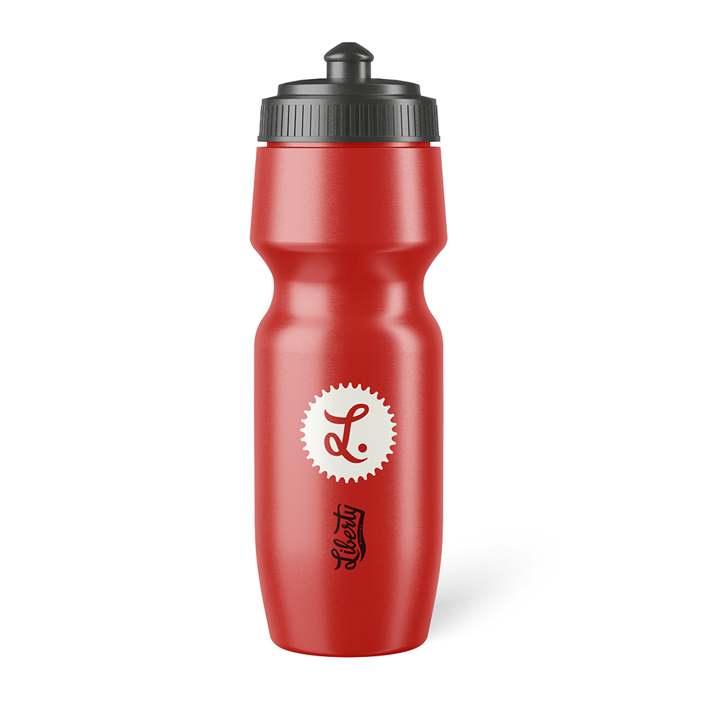
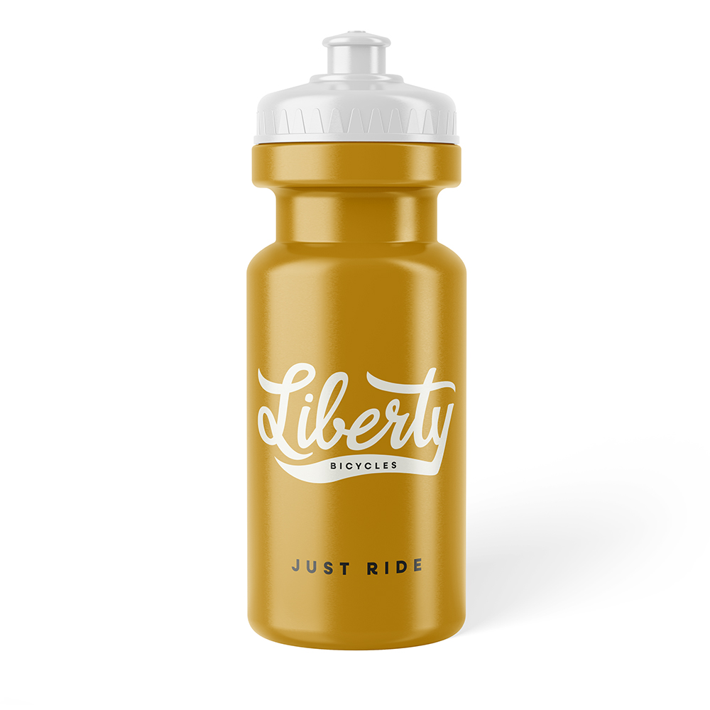
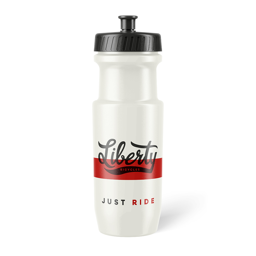
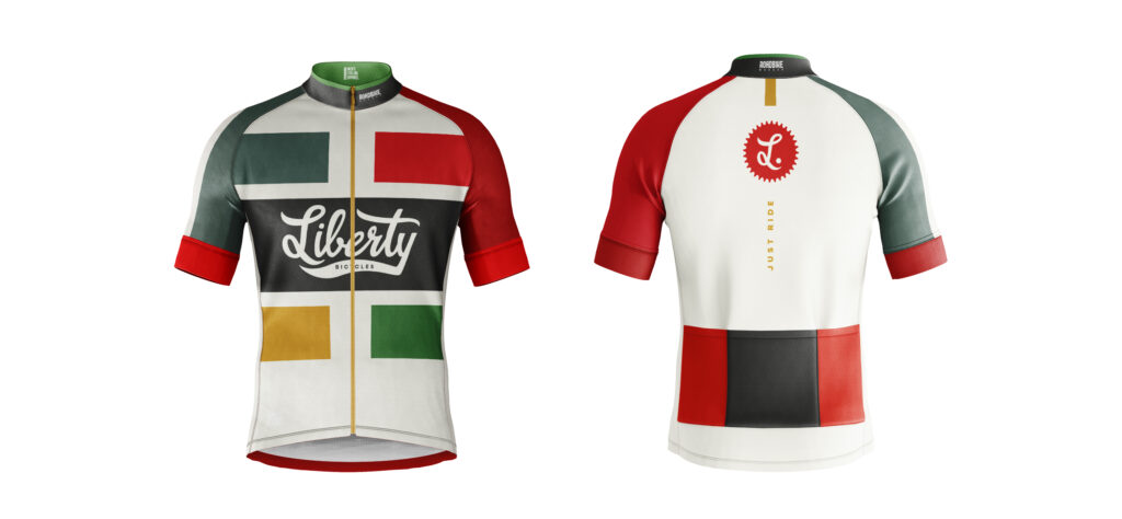
It’s no longer cutting-edge tech — it’s giving warmer lifestyle brand. Quirky, charming, full of feeling.
That’s the magic (and responsibility) of color.
It’s not just decoration. It’s definition.
Because you’re not just building a brand —
You’re building a world.
One that people want to step into.
One that makes sense the second they see it.
One that feels consistent, on every level.
If your colors don’t match the emotional tone of your brand — the whole thing can fall flat, or worse, feel confusing.
And if you want people to connect with your brand, they need clarity. They need to feel what you’re about, instantly.
So how do you use color with intention?
Start with the story.
Ask yourself:
- How do I want people to feel when they land on my site?
- What energy do I want to bring into the room?
- Is this brand grounded or playful? Minimal or lush? Serious or romantic?
Then? Build your palette to match.
Let the colors do the talking. Let them carry the mood. Let them support the message — not contradict it.
Because color isn’t just a style choice.
It’s one of your strongest storytellers.
So use it wisely.
Build it deliberately.
And don’t just aim for something that looks good — build something that feels unforgettable.
Want a brand that actually makes people feel something?
Let’s build it right.

be the first to leave a comment