
When Everything Is Important, Nothing Is
If no one is in charge, the empire falls apart. (I promise this isn’t political 😂)
Hear me out… If the king or queen disappears, stops guiding things well, or is simply weak in their role… chaos usually follows.
People begin competing for attention.
The structure weakens.
Trust erodes.
Everything starts pulling in different directions.
Honestly, I think website design works the exact same way.
One of the biggest problems I see in website design isn’t necessarily a lack of beauty. It’s a lack of hierarchy. Everything is trying to speak at once.
The headline wants attention.
The images want attention.
The secondary type wants attention.
The colors want attention.
The animations want attention.
The buttons want attention.
Every section is trying to become “the moment.”
And when everything is screaming for attention at the same volume, the experience becomes exhausting instead of engaging. People don’t know where to look first. So instead of being pulled deeper into a story, they disconnect from it entirely.
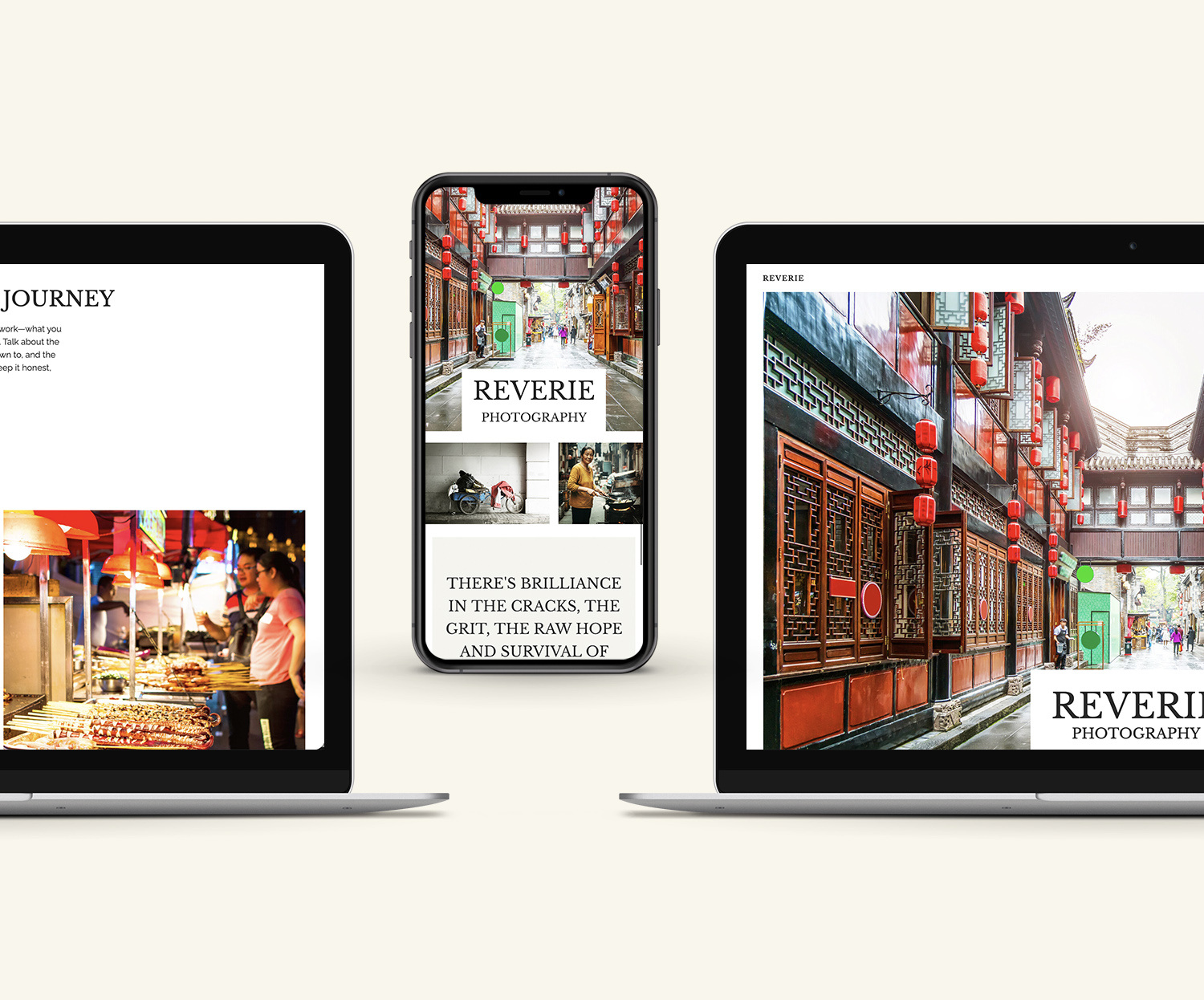
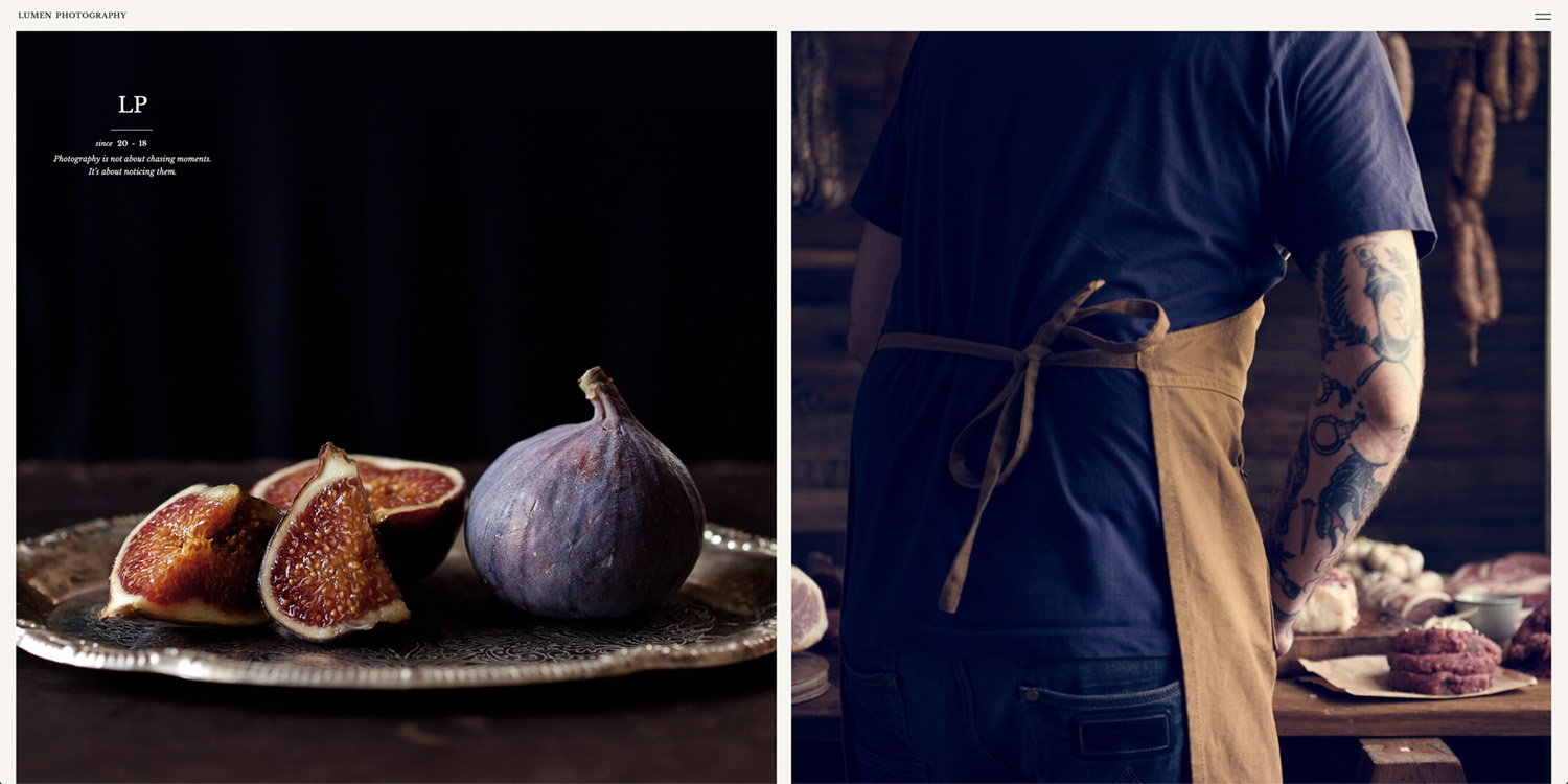
Good Design Creates Order
A strong brand experience should guide someone naturally. When someone lands on a website, they shouldn’t have to work hard to figure out:
- what the business does
- what matters most
- where to look next
- what action to take
- how they’re supposed to feel
The best websites create a kind of effortless movement.
Look here first.
Now here.
Now go deeper.
That movement is hierarchy. And hierarchy isn’t just created through large headlines or bold text. It’s built through dozens of intentional decisions working together:
- spacing
- typography
- image scale
- pacing
- contrast
- color
- restraint
- repetition
- rhythm
Even silence plays a role. Sometimes the most powerful thing on a page is the thing given enough space to breathe.
The Problem With “Everything At Once”
I think a lot of brands unintentionally create visual chaos because they’re afraid of not saying enough. Or they think everything they are saying and showing is important so they don’t allow anything to take a backseat. So the homepage becomes:
- multiple fonts and sizes
- multiple calls to action
- large blocks of copy
- movement everywhere
- too many images
- competing sections
- too many ideas introduced too quickly
The result is usually overwhelm. Not because the brand lacks creativity, but because there’s no clear leadership within the system. No guiding voice saying: this matters most first. Ironically, the more premium a brand feels, the more intentional the hierarchy usually becomes. Luxury branding rarely feels chaotic. It feels controlled. Restrained. Confident. It knows when to speak loudly and when to pull back.
Hierarchy Builds Trust
This is the part people often overlook. Hierarchy doesn’t just improve aesthetics. It improves trust. When a website feels easy to move through, people subconsciously feel guided and taken care of. The experience feels considered. That sense of clarity creates confidence in the brand itself. And that’s important because most people decide how they feel about a brand long before they consciously analyze the details. They feel the experience before they fully process it.
Structure Makes Creativity Stronger
I think some people hear the word “structure” and assume it limits creativity. But honestly, structure is what allows creativity to land. Even the boldest, most expressive brands still need an underlying system holding everything together. Without structure, creativity turns into noise. Without hierarchy, even beautiful brands can feel chaotic. But when hierarchy is done well, you can pull someone into an entire world without them even realizing they’re being guided through it. And that’s where branding starts becoming more than decoration.
It becomes experience.
be the first to leave a comment