
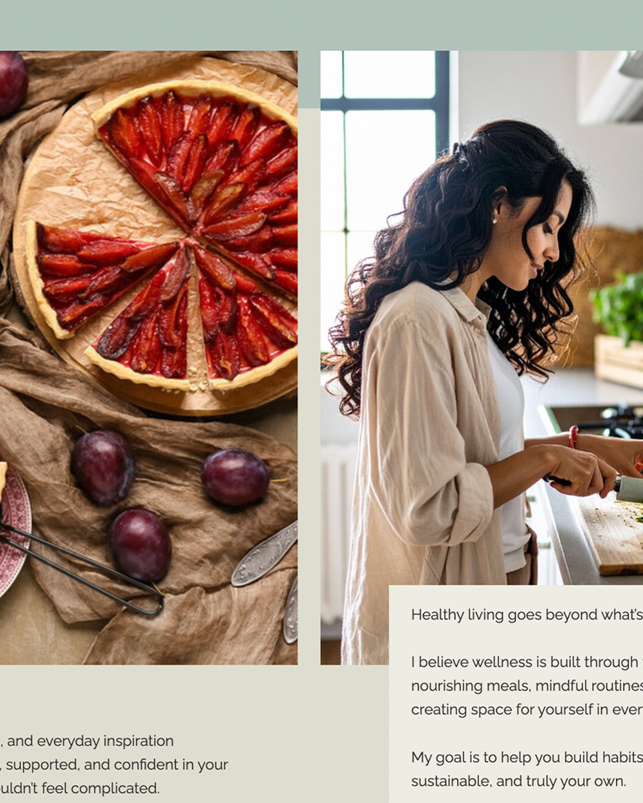
Type Matters.
Typography Isn’t Decoration. It’s Communication.
Typography isn’t about picking a pretty font.
It’s not about what’s trending on Pinterest.
It’s not about what “feels cool.”
Type is voice.
Type is attitude.
Type is the loudest thing you’re saying — without opening your mouth.
And when you get it right?
It doesn’t just look good.
It feels right.
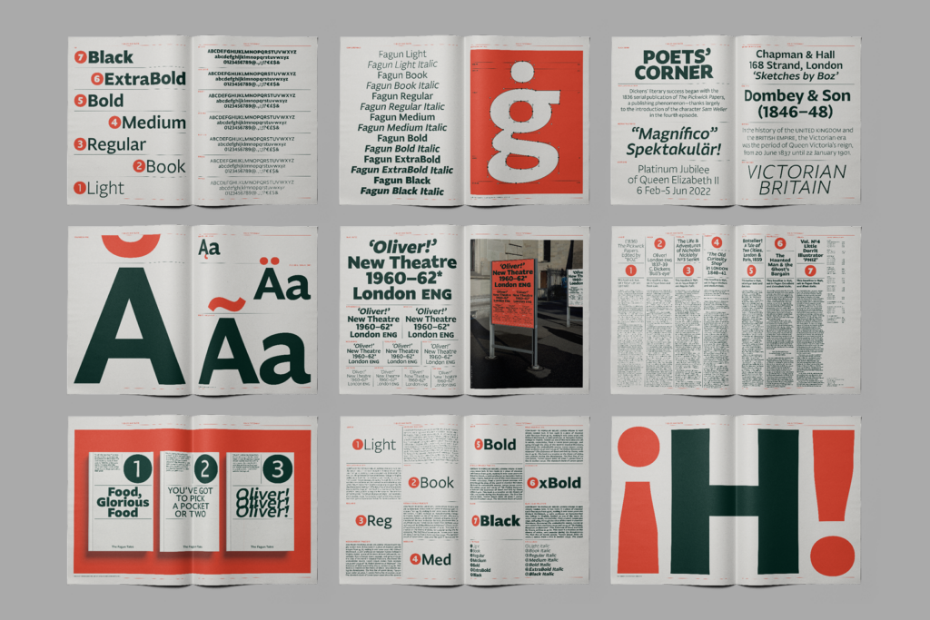
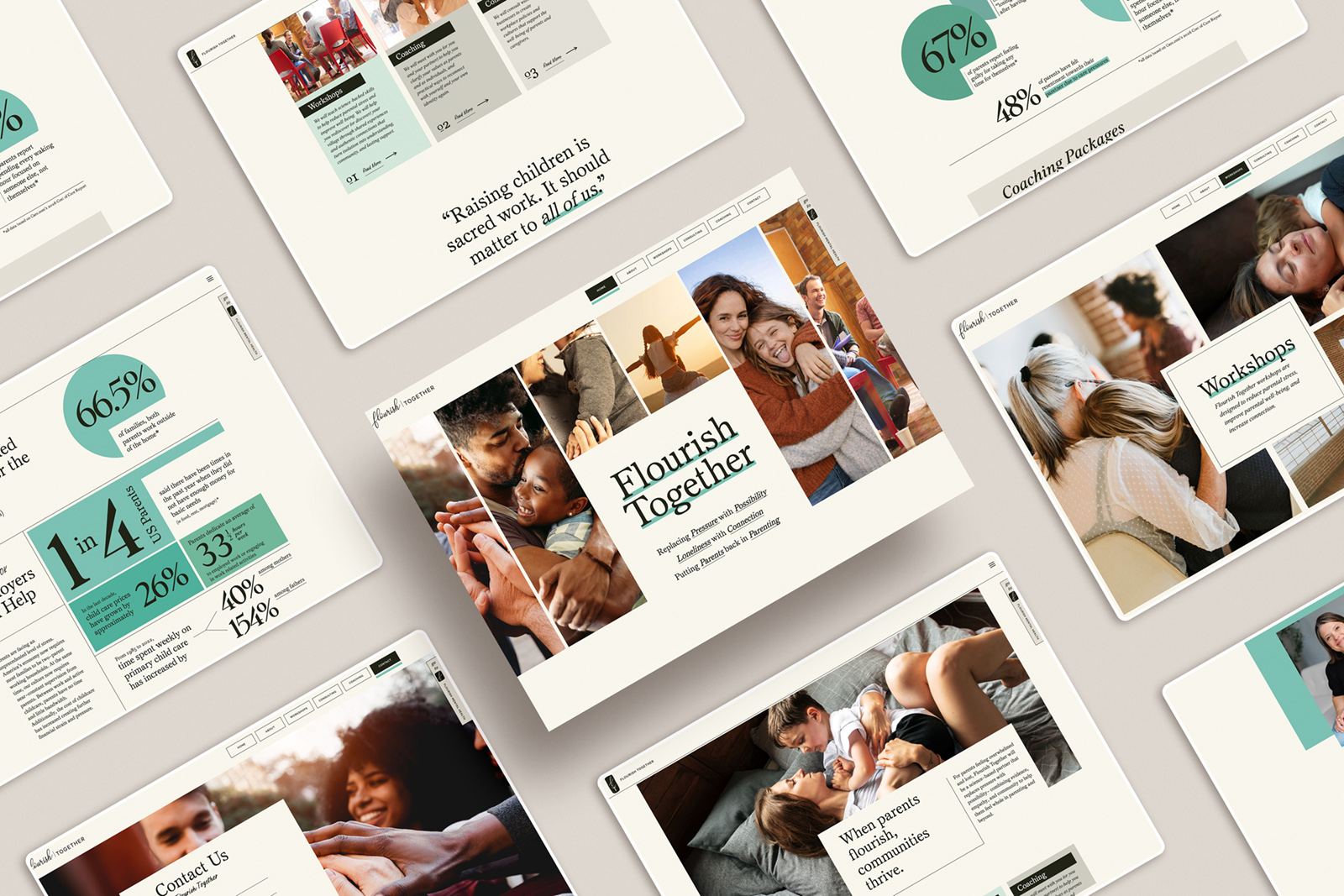
Typography is casting.
Your brand is the script.
The typeface is the actor that delivers it.
What’s the tone?
- Bold and unshakable?
- Elegant and aspirational?
- Playful and human?


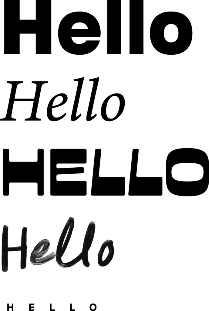
One phrase — a thousand different voices — depending on the type you choose.
Take this:
“We’re so glad you’re here.”
Sharp, all-caps serif: Formal. Exclusive. High-end.
Rounded sans-serif: Friendly. Easygoing. Maybe even a little quirky.
Same words. Different worlds.
That’s the power of typography.
And most people are ignoring it.
Here’s the mistake:
They treat type like a finishing touch.
An accessory.
An afterthought.
Wrong.
Typography is structure.
It’s architecture.
It’s how your brand holds together — or falls apart.
If your typography doesn’t match your story, your audience feels it.
Even if they can’t say why.
Confusion kills connection.
Inconsistency breaks trust.
When your typography aligns with your message?
It builds something bigger:
- Clarity.
- Consistency.
- Recognition.
- Loyalty.
Good typography doesn’t whisper.
It announces.
It shapes how people feel about you before they even know your name.
So don’t pick fonts because they look “cute.”
Pick fonts because they speak.
Pick fonts because they mean something.
Because every single letter matters.
In branding, typography isn’t a detail.
It’s the main event.
be the first to leave a comment